The Best Interior Paint Colors for a Georgia Home This Winter
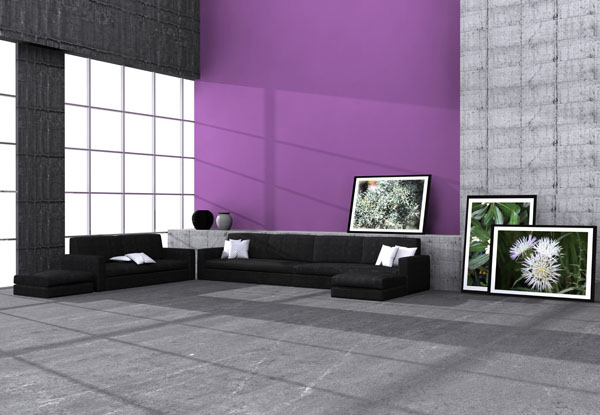
You have a color in mind, or maybe five, and you are trying to pick before the crew shows up. Here is the thing most color guides leave out: the color in the can is not the color on your wall. A gray that looks crisp on a store chip can turn cold and blue on a north-facing Gwinnett wall in December, and a beige that looked bland under the fluorescents can glow warm and calm once it is up. Winter light in Georgia is lower, longer, and cooler than summer light, and it changes how every color reads on your walls. That is the whole reason color selection is worth slowing down on.
Southern Perfection Painting Inc. (SPPI) has served Gwinnett County and the greater metro Atlanta area since 1984, and after 42 years painting interiors through Georgia winters we do not pick color off a chart in the truck. We hold the sample against your actual wall, in your actual light, at the time of day the room gets used, before anyone opens a can. We are fully licensed, bonded, and insured, our estimates are free and itemized, and we guarantee no change-order surprises: the number we quote is the number you pay. Here are the colors that work in a Georgia home this season, and why.
What Are the Best Interior Paint Colors for a Home?
The best interior paint colors for most homes are warm, soft neutrals: greige, warm white, mushroom taupe, soft sage, and gentle warm gray. They read calm, they suit almost any furniture and floor, and they hold their value when you sell, which is why they are the backbone of nearly every interior we paint. The move that separates a good color job from a flat one is picking a neutral with the right undertone for your light, then letting sheen and trim do the rest.
Run from the safest, most flexible neutrals to the ones that ask a little more of the room, the warm-neutral family lines up like this, and each one has a place in a Georgia home:
- Warm white: the most flexible of all. Brightens small or low-light rooms and reads clean without the cold, blue edge of a stark white. Best in rooms that need to feel bigger and lighter.
- Greige: the workhorse. A gray-beige blend that stays neutral in almost any light, which is why it is the single most requested wall color we put up. Living rooms, hallways, open-plan main floors.
- Mushroom taupe: a touch warmer and cozier than greige. Reads soft and grounded, good in bedrooms and dens where you want the room to feel settled rather than bright.
- Soft sage: a muted green-gray that acts almost like a neutral. Adds quiet color without committing to a bold wall. Nice in bedrooms, offices, and powder rooms.
- Warm gray: gray with enough warm undertone that it never goes cold. The right pick when you want gray but not the chilly, builder-flip gray everyone regrets.
What Interior Paint Colors Work Best in Georgia Homes?
In Georgia homes, warm neutrals almost always beat cool ones, because our natural light and housing stock both pull warmer, and a cool gray that looks current in a magazine can go cold and dingy on a real Gwinnett wall. Our long, low winter sun and the abundance of warm-toned brick, oak floors, and stained trim across metro Atlanta homes mean a warm-undertone neutral reads harmonious while a blue-gray reads out of place. The direction your windows face is the deciding factor.
Light changes a color more than any other single thing, and in a Georgia home it breaks down by exposure:
- North-facing rooms get cool, indirect light all day, which pushes any color toward gray and blue. These rooms need the warmest neutrals you are comfortable with, warm white, greige, mushroom, to keep from feeling cold, especially in winter.
- South-facing rooms take the strongest, warmest light and can carry cooler or bolder colors without going flat. A soft sage or a deeper greige holds up beautifully here.
- West-facing rooms get hard, warm afternoon sun that intensifies warm undertones and can make a red-based beige look orange by 5 p.m. In our sun-raked west-facing family rooms we lean toward balanced greige over a warm-heavy beige.
- East-facing rooms get bright morning light that cools off by afternoon, so a color you love at breakfast may read flatter at dinner. We sample these at both times.
"After 42 years painting Gwinnett interiors, the colors that disappoint are almost always cool grays chosen off a chip and put up on a north wall. They photograph fine and live cold. We steer homeowners toward a warm-undertone neutral here for a reason: it is what actually holds up in our light."
Housing stock matters too. Older homes near a Lawrenceville or Grayson historic square often carry stained trim, warm oak floors, and original plaster, and a warm neutral ties those elements together where a cool gray fights them. Newer 1990s-and-later subdivision homes across Suwanee, Buford, and Duluth usually have white trim and lighter floors, which give you more room to go a touch cooler if you want. We read those existing finishes before recommending a palette. You can see how we approach a whole-home color plan on our professional interior painting across Gwinnett County page, and how we handle it locally with our interior painters in Lawrenceville. Want a straight read on your rooms? Call (770) 985-3075 for a free itemized estimate.
The Best Low-VOC Interior Paint Lines We Use
For interiors we use premium low-VOC Sherwin-Williams and Benjamin Moore lines as standard, never builder-grade paint, and in a closed-up winter house that low-VOC choice matters as much as the color. When the windows stay shut for the season, the strong solvent smell of a cheap paint lingers in bedrooms and nurseries for days. Premium low-VOC and low-odor paint means you can use the room again far sooner, which is exactly the advantage you want in the cold months when you cannot air the house out.
These are the interior lines we reach for, and the color reads a little differently in each:
| Line | Why we use it | Best for |
|---|---|---|
| Sherwin-Williams Emerald Interior | Low-VOC, excellent hide and washability, deep rich color | Main living spaces, high-traffic walls |
| Sherwin-Williams Duration Home | Low-VOC, tough and scrubbable, easy to clean | Hallways, kids' rooms, busy family areas |
| Benjamin Moore Regal Select | Low-VOC, smooth flow, beautifully even color | Bedrooms, living rooms, formal spaces |
| Benjamin Moore Aura | Low-VOC, exceptional color depth and coverage | Rich or deep colors, feature walls |
Whichever line a room calls for, the premium paint under the color is doing quiet work you never see: it holds the color truer, resists fading in the winter light, and cleans without burnishing to a shiny spot. A cheap paint in a beautiful color still fades and streaks. That is why we hold the same Sherwin-Williams and Benjamin Moore standard on every interior, from the walls to the trim to a coordinated kitchen cabinet painting refresh in the same visit.
How Does Paint Sheen Change the Color, Room by Room?
Sheen changes how light bounces off the wall, so the exact same color looks different in flat, eggshell, satin, and semi-gloss: flatter sheens read softer and deeper, shinier sheens read lighter and can wash the color out under strong light. That means picking a color and picking a sheen are one decision, not two, and the right pairing changes room by room based on how each space is used and lit.
Here is how we pair color and sheen across a typical Georgia home:
- Ceilings: flat, in a warm white a shade lighter than the walls. Flat hides drywall texture and never bounces light down into a shiny plane overhead.
- Living rooms and bedrooms: eggshell in your chosen neutral. Eggshell keeps the color soft and deep and hides small wall flaws in raking winter light.
- Hallways and kids' rooms: satin. A touch shinier and far more scrubbable, so the color survives hands and furniture. Note that satin will read a shade lighter than the same color in eggshell.
- Kitchens and baths: satin walls, semi-gloss on splash zones. The higher sheen takes moisture and wiping, but it also lightens and cools the color, so we often pick the wall neutral a half-step warmer to compensate.
- Trim, doors, and crown molding: semi-gloss or gloss, usually in a clean warm white. The shine gives a crisp line against the flatter wall color and is what makes a repaint read as finished.
"The mistake we correct most is a homeowner who loved a color on an eggshell sample, then put it up in satin in the kitchen and wondered why it looked washed out. Same color, different sheen, different room. Sheen is part of the color decision, not an afterthought."
This is exactly why we sample color in the sheen it will actually be painted in, on the actual wall, before committing. A chip under store lighting tells you almost nothing about how that neutral will read in eggshell on your north-facing bedroom wall at 4 p.m. in January. Our estimators help you narrow the Sherwin-Williams and Benjamin Moore palettes to tones that suit each room's light and pair them with the right sheen before a brush touches the wall. Get a free itemized estimate and we will map color and sheen for every surface.
HOA and Condo Interior Color: What to Check First
Interior wall color is almost always your own choice, even in an HOA or condo community, but there are two places the rules can reach inside, and both are common across Gwinnett and North Fulton communities. Front doors and any surface visible from a shared hallway or exterior are frequently governed by the association, and condos often have specific rules about what a unit owner can change versus what belongs to the building. Check before you commit to a bold front-door color or repaint a shared-corridor-facing surface.
Across the HOA communities we paint in Duluth, Suwanee, Johns Creek, and the surrounding metro, the pattern is consistent: your interior walls are yours, but anything the neighbors can see may need board approval. We have painted enough of these communities to know where the lines usually fall, and we are glad to work within an approved palette when your association has one. If you are in a managed community and unsure, we will flag it during the estimate so a color choice does not turn into a compliance headache after the fact.
When You Should Not Repaint for Color Yet, and We Will Tell You
We would rather lose a quick job than book one we know will disappoint. Do not repaint a room for a new color if the walls have an unresolved moisture stain or a bleeding ceiling spot, because a beautiful new neutral just hides a leak until it telegraphs back through, and that is a repair to fix first, in some cases another trade's work entirely, since SPPI is a painting contractor, not a roofer or a general contractor. Do not chase a trendy color you are lukewarm on either; a warm neutral you will still like in five years beats a bold wall you tire of in one. And if you repainted a low-traffic room two years ago in a color that still reads well and cleans up, you do not need to redo it for color alone, and we will tell you to spend the project on the worn hallway or the dated kitchen instead.
Why the Light, Not Just the Chip, Decides the Color
The thread through all of this is simple. The color on the chip is a starting point; the color on your wall is the light in your room, the undertone you chose, the sheen you painted it in, and the trim and floors around it, all working together. Warm neutrals suit Georgia light and Georgia homes. North-facing rooms want the warmest of them. Sheen shifts every color, so it is part of the choice. Get those right, in your own light, at the time of day the room gets used, and the whole house reads as genuinely, thoughtfully repainted rather than just recolored.
"The color on the chip is a starting point; the color on your wall is the light in your room, the undertone you chose, and the sheen you painted it in, all working together."
Every SPPI interior project starts with a walk-through where we read the light, the existing finishes, and any HOA considerations, followed by proper cleaning, drywall and trim repair, priming, and premium low-VOC Sherwin-Williams and Benjamin Moore coatings in the right color and sheen for every surface, all by our own trained W-2 crews supervised daily by an English-speaking foreman, and backed by a standard 1-year interior warranty on labor and materials. Nobody's perfect, but we get pretty darn close, and reading your light before we recommend a color is a big part of how we get there.
Frequently Asked Questions
What is the best paint sheen for interior walls?
For most interior walls in a Georgia home, eggshell or satin is the best sheen, and the choice between them comes down to traffic. Eggshell has a soft, low glow that keeps the color deep and hides small wall imperfections, which makes it the everyday pick for living rooms, bedrooms, and formal spaces. Satin is a step shinier and noticeably more scrubbable, so it wins in hallways, kids' rooms, kitchens, and baths where hands, steam, and furniture hit the walls. Reserve flat for ceilings and low-traffic formal rooms, and step up to semi-gloss or gloss only on trim, doors, and cabinets where you want durability and a crisp line. Remember that sheen changes the color too: the same neutral reads a shade deeper in eggshell and a shade lighter and cooler in satin, so we sample color in the sheen it will actually be painted in. In our humid metro Atlanta climate we lean toward satin in the wettest, highest-touch rooms because it wipes clean and resists moisture where a flatter finish would streak and grow mildew.
Are warm or cool paint colors better for a Georgia home?
Warm neutrals are usually the better call in a Georgia home. Our natural light pulls warm, especially the low winter sun, and metro Atlanta housing stock is full of warm-toned brick, oak floors, and stained trim that a warm-undertone neutral ties together while a cool blue-gray fights. A cool gray that looks current on a chip often goes cold and dingy on a real north-facing wall here. That does not mean you can never go cool; a south-facing room with lots of light and white trim can carry a cooler neutral. But as a default across the rooms we paint in Gwinnett and North Fulton, greige, warm white, mushroom taupe, soft sage, and warm gray hold up better in our light than their cool counterparts. We read the direction your windows face and the finishes already in the room before recommending an undertone.
What are the best low-VOC interior paints?
The low-VOC interior lines we use as standard are Sherwin-Williams Emerald and Duration Home, and Benjamin Moore Regal Select and Aura. All four are premium, low-VOC, low-odor paints that hold color truer, resist fading in winter light, and clean without burnishing, and none of them are builder-grade. The low-VOC formulation matters most in the cold months, when a heated, closed-up house traps paint odor indoors; a low-VOC premium line cuts the smell to a mild level and lets you put the room back into service in a day rather than a week. We match the specific line to the room: Emerald or Duration Home for high-traffic living spaces and hallways, Regal Select or Aura for bedrooms and rich, deep colors.
Get a Straight Read on Your Interior Colors
The surest way to land on a color you will still love in five years is to have someone who paints these metro Atlanta interiors hold the samples against your actual walls, in your actual light, and pair each one with the right sheen for the room. We offer free, detailed, itemized estimates with a 48-hour response window, and we guarantee no change-order surprises. The number we quote is the number you pay. Call (770) 985-3075 or request one online.
Learn more about our professional interior painting across Gwinnett County, see how we approach interior painting in Lawrenceville and interior painting in Dacula, or read about kitchen cabinet painting as part of a coordinated interior refresh.
Request your free interior painting estimate today and let Southern Perfection Painting help you choose the right color for every room before the Georgia winter sets in.